Offering a seamless and intuitive user experience has always been at the heart of Zendesk QA (formerly Klaus).
The same goes for making sure that we remain in sync with the ever-evolving landscape and implement enhancements that make your experience with Zendesk QA better than ever.
By listening to our customers, staying on top of growing product needs, and gaining valuable insights from research, we pinpointed and tackled the main bottlenecks with the current experience:
- Striving for consistency: Over the years, a variety of design approaches have been applied to the platform, leading to a slightly disjointed visual experience when moving from one page to another. Our mission was to create a more harmonious and consistent look and feel across the platform.
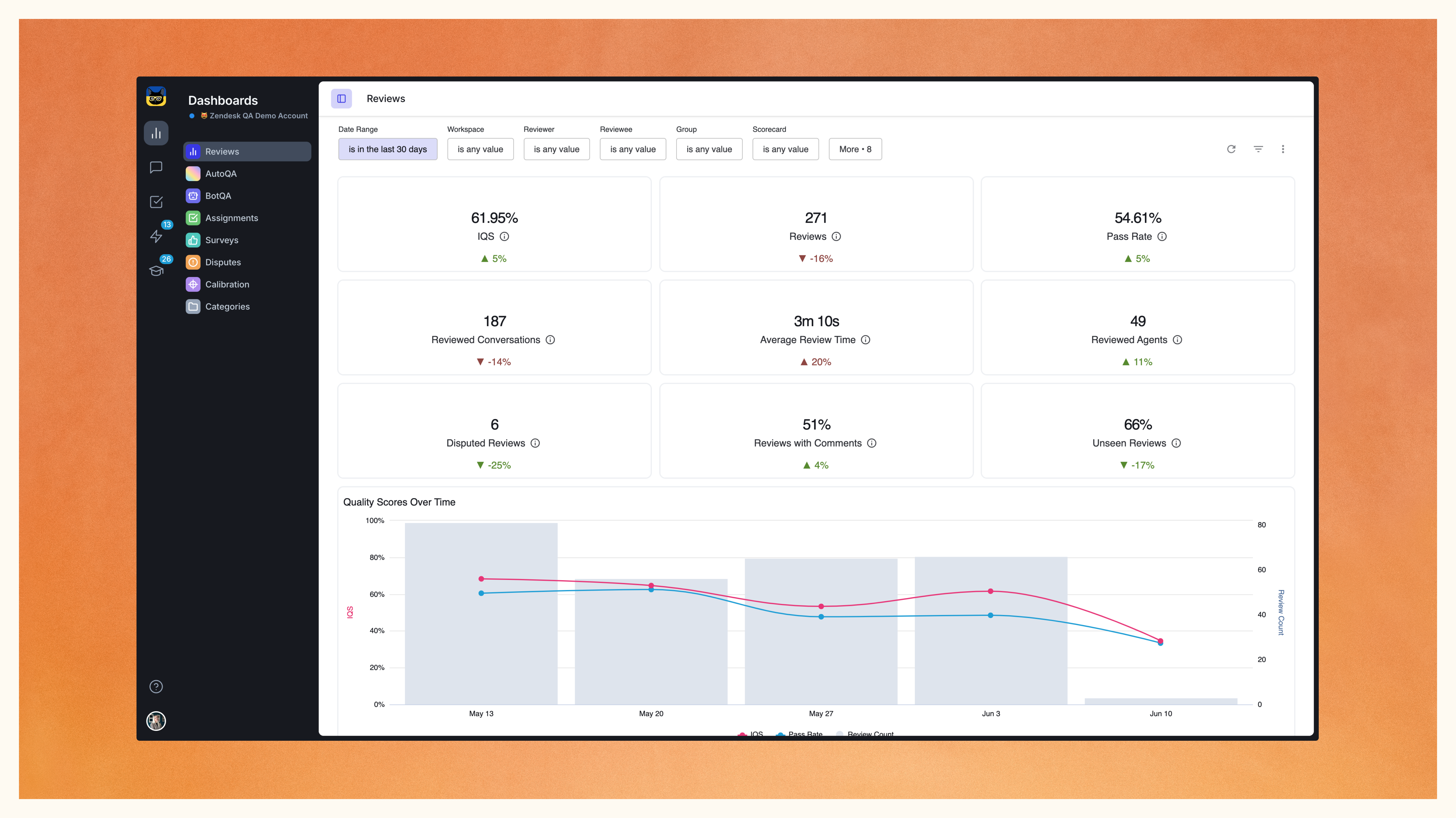
- Tackling information overload: With the introduction of AutoQA, we found ourselves processing an astonishing 250 times more data, resulting in an increased amount of information for our users to navigate. Our objective was to simplify this data overload, making it easier for users to extract the most relevant information, thus facilitating well-informed business decisions.
- Empowering customization: To accommodate smaller screens with limited space, our goal was to give users the ability to customize their screen content according to their unique preferences, providing them with a sense of control and personalization.
Here’s what’s new.
Unifying the experience across the platform
Several of these updates center around the core pages of our application. The changes aim to enhance not only the visual aspects but also create a more user-friendly and consistent interface.
Separation of navigation and content
In the updated design, you’ll notice a clear distinction between navigation and content. The dark-themed navigation bar ensures that your navigation elements are easily distinguishable from the light-themed content. This separation not only looks sleek but also simplifies the user’s journey within the app.
We’ve implemented this structure across all core pages, ensuring a consistent and familiar look as you navigate through our platform.
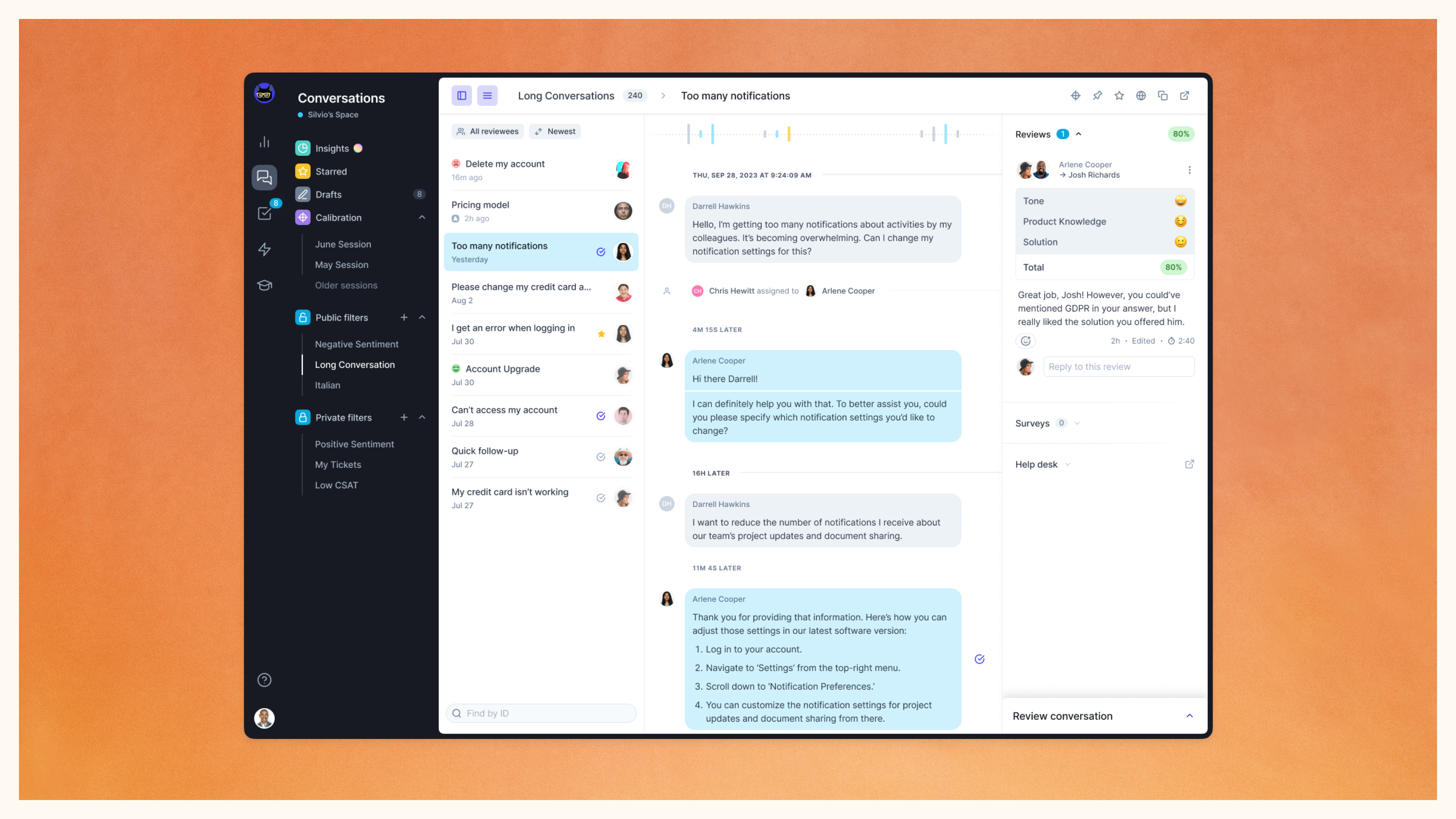
Collapsible sidebars
We understand that sometimes you need to declutter your workspace. That’s why we’ve introduced collapsible sidebars. You can now hide unnecessary app elements, such as the filters sidebar or the conversations list view, giving you a clean and focused interface.

Unified header for actions
Our new unified header serves as a central hub for all page actions. Wherever you are within the app, you’ll have consistent navigation and functionality at your fingertips, enhancing the intuitive and efficient Klaus experience.
Bringing clarity to the review process
At the heart of Zendesk QA (formerly Klaus) stands the Conversation view, which has now been reimagined to provide a user-friendly experience, addressing the challenges of cognitive overload and scattered information.
Filtering made easy
We’ve completely revamped our conversation filters, making it easier to discover and explore the ones that interest you, with detailed descriptions available for each filter.

Consolidating the review panel
All relevant data has now been consolidated into one vertical, expandable section within the conversation review panel. This ensures that you have all the information you need at your fingertips, without cluttering the space.
Also, the conversation metadata, which was previously visible in the expandable header, is now also located at the top the sidebar.

Cleaning up the comments
Subtle yet impactful changes to the layout and visuals of the commenting experience have made the interface cleaner and more enjoyable to use.
The devil’s in the details
Our redesign is all about small but impactful user experience improvements. From the new framework to the conversation panel and comments, every change aims to make your experience with us more user-friendly, organized, and visually appealing.
We’re eager to hear your feedback and continuously strive to add a touch of magic to your workdays involving Zendesk QA (formerly Klaus). Should you have any questions or suggestions for future improvements, make sure to get in touch!