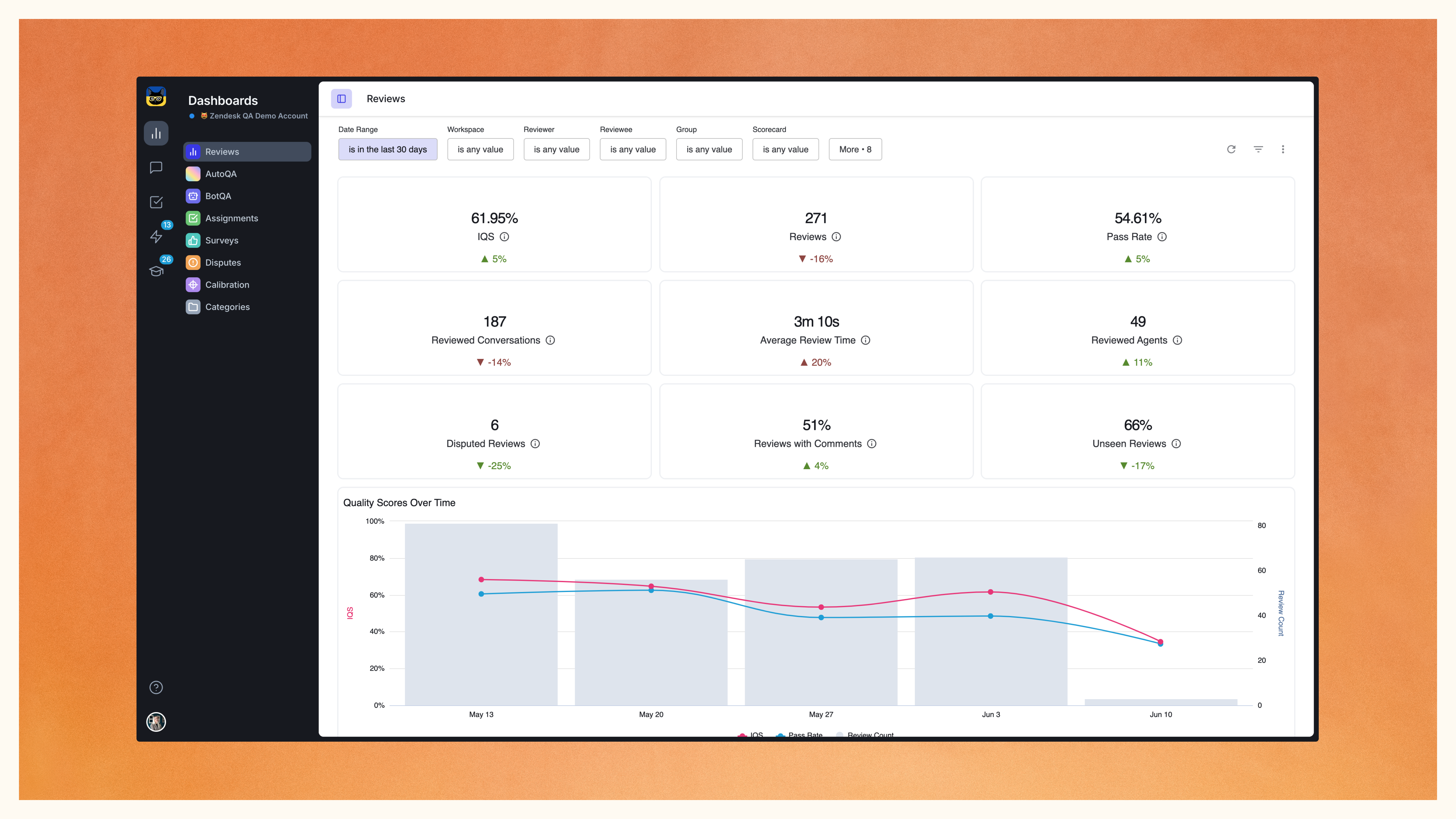
With a refreshed interface and added functionalities, navigating through metrics and KPIs has never been easier. Now you can seamlessly zoom into specific conversations directly from your dashboard.
Enjoy the new look and feel of the Zendesk QA dashboard and make the most of your QA program with new functionalities:
- Deep dive into conversation data straight from the dashboard
- Track metrics like average review times, reviewed agents, disputed reviews, and unseen reviews on new metrics cards
- Monitor quality scores across categories, reviewer and reviewee performance, and many more QA KPIs through new graphs
Find the conversations and reviews you need with the enhanced filtering experience.
Refined filtering capabilities
The latest updates to our Reviews dashboard allow you to experience a smoother navigation and enhanced filtering capabilities. If you are already acquainted with our AutoQA dashboard, you will notice the new filters panel shares its layout.
Before delving into the new filtering options, keep in mind to apply and modify filters by clicking the new blue reload button.
This update introduces several new filtering options:
- Reviewer and Reviewee filters: focus specifically on the user groups that matter most to you, replacing the old “Received” and “Given” toggle views.
- Updated sorting: automatically view the most recent data with the dashboard sorted by Conversation Created Date, now enabled by default. Easily switch to Review Created Data mode in the More section.
- Assignments filter: Utilize the new Assignments filter to access manual review data based on active assignments accessible to you.
- New custom filtering options: Filtering your dashboard data with custom fields is now more straightforward with the new Helpdesk field and Helpdesk value options. For instance, use a custom field like ‘Custom tier’ to refine your view. When selected in the Filter tab, the Helpdesk Value field will populate all possible options, such as Enterprise, Mid-market, SMB, allowing you to view review data exclusively for specific ticket tiers, such as Enterprise (under Helpdesk value).
Navigate through your QA Review dashboard and extract valuable insights with ease, ultimately enhancing your service quality and customer satisfaction.
Assessing QA program efficiency
Your QA program helps you boost your customer service performance, but do you know how efficient your QA program itself is?
Keep a close eye on the Average review time and Reviewed agents via the new metrics cards on your QA dashboard. Promptly identify any quality reviews discrepancies to ensure your team stays on track with your QA program goals.
Additionally, gain insight into the quality of reviews with the new Disputed reviews metrics card, spotlighting any urgent issues within your QA program.
On top of that, the new Unseen reviews metrics card ensures that no feedback goes unnoticed, providing visibility into the reviews awaiting attention.
Visualizing service quality
One graph says more than a thousand words. We gave you twelve new graphs to tell you all you need to know about your customer service quality.
- Focus on your Quality Scores and how they change over time: now the graphs also showcase IQS, pass rate and review count to provide additional insight into your quality scores.
- Category-specific graphs allow you to pinpoint the strengths and weaknesses within your support team, enabling targeted actions for improvement.
- Your best conversations are now highlighted in the Category score over 80% graph, and the Average Category Scores reveal how category scores perform against the pre-defined 80% quality threshold.
- The new Category score 0% graph draws your attention to the most critical conversations that have failed to meet your quality standards.
Explore category performances further with graphs showcasing category scores per user groups, enabling a micro view of your service quality, and find additional insights in the Category insights section.
More focus on performance
Identify core issues in your team’s performance with the new Root causes graph, now part of your QA dashboard. Notice and address the most critical issues as soon as they occur.
Additional performance graphs break your performance data down by workspace, reviewer, and reviewee, and a separate graph reveals scores by reviews, offering a nuanced understanding of your team’s performance dynamics.
Please note that it generally takes about 15 minutes to refresh the QA dashboard, with new review data appearing within 30 minutes.